
For the first Friendly Friday Challenge of the year, Sarah’s asked us to share photos demonstrating the Rule of Thirds.
The Rule of Thirds (RoT) is a well known composition principle taught in photography and art classes. Pretty much all cameras come equipped with a nine grid overlay to help in framing photos according to the RoT.
Personally, I find the grids distracting and always turn them off. I am an intuitive shooter and I usually frame shots without thinking about rules. It’s interesting then, that when I look the picture afterwards, the rules seem to naturally apply.
To demonstrate, here are two pictures from my catalog. One which I shared in an earlier post and another which I’ve never published. I layered on the RoT grid and thought about what worked and what didn’t.
Starting with the picture that didn’t work.
Originally, I wanted to take a picture of these magnificient doors in Seoul’s Deoksugung Palace. The boys sitting on the steps were useful in giving a sense of scale. Although the picture of the door was perfectly aligned to the RoT grid, I found the overall image unbalanced and slightly off.

The reason was that the center core of the picture had no interest, it was a static void. The most interesting parts were crowded into the lower third frame. Even then, the boys were off-center, filling in an uneasy three quarters’ frame.
I took a second shot and framed the picture to the boys rather than the door.
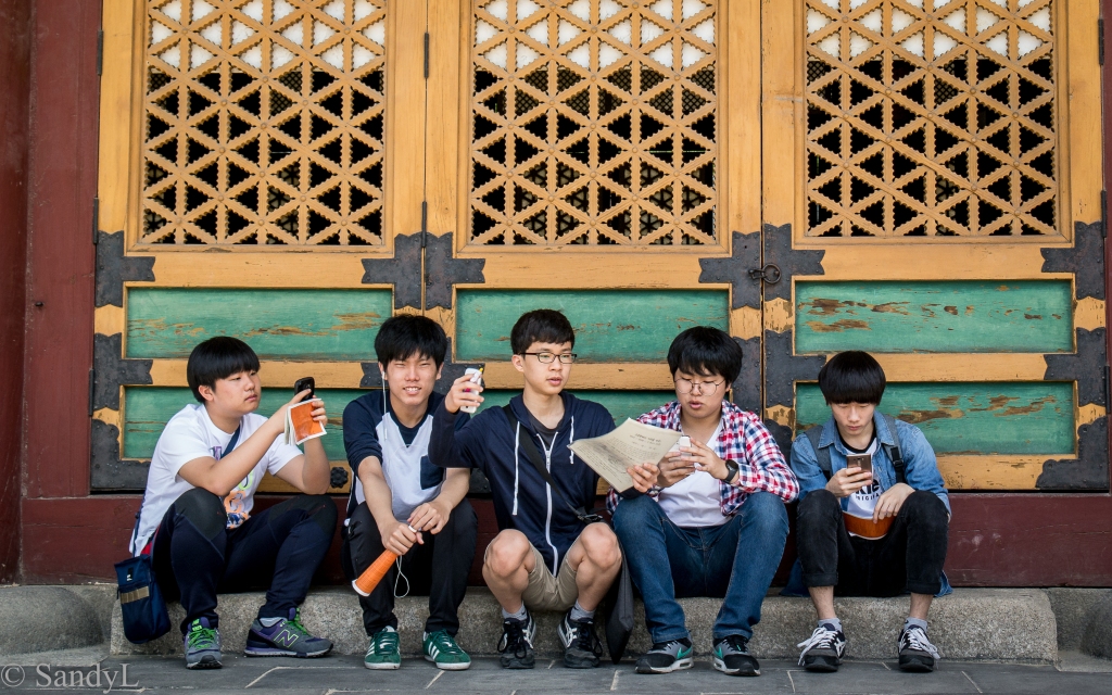
I was much happier with this image. It worked because all of the action is in the center panel with enough visual interest in adjacent squares to move the eye around.

Which demonstrate a couple other points about the the Rule of Thirds. The center panels should always have some visual interest with enough activity in adjacent panels to move the eye around. Is this a rule or a guideline? I don’t know but it is something that I look for whenever I assess a photo for keeping or binning.
Do you have any thoughts about the Rule of Thirds? Have you ever assessed a picture in terms of what works, what doesn’t and why? Here’s a chance to do so and participate in this week’s Friendly Friday Challenge.
I look forward to reading your post!

Interesting observation that even when following the rule of thirds there should be something of interest in the central panel. I also prefer something in the middle; to shoot the rule of thirds I actually had to go out and shoot with that in mind!
LikeLiked by 1 person
I think it’s good to practise, see what works and then do whatever you want 🙂
LikeLike
I adore your example for rule of thirds. Well done 😀 😀
Here is my entry.
LikeLiked by 1 person
It’s always a pleasure to see your posts Cee. Thanks for joining in & sharing some excellent examples!
LikeLiked by 1 person
I thought of saying “Just three photos?” 😮 But I saw there was another post on this subject today. Good. I need all the guidelines I could get (and still fail). As for this photo… Hm… But now you lose all the door!!
LikeLiked by 1 person
He he. My other post is Just-three as well 😉
Somehow, (I don’t know why 😮) I knew that you’d be an advocate for the door picture!
I reply to Sheree below with a link to an article that gives a good description of the Rule of Thirds applied to classic paintings. You might find it interesting too https://mymodernmet.com/rule-of-thirds-definition/
LikeLiked by 1 person
Hihih. You don’t cut a door if I can help it! 😉 Thank you for this link. I need all the help I can get.
LikeLike
Hi, Sandy – Your photos here brilliantly display the Rule of Thirds (and the importance of the centre panel being visually interesting). Nicely done!
LikeLiked by 1 person
I’m glad you like the picture Donna.
LikeLike
Great images cropped to Three Sandy. It is a bit difficult for me to do.
LikeLiked by 1 person
It’s sufficient to have beautiful images that please yourself and you do that just fine!
LikeLike
Not long ago I turned the grid on mostly to keep the horizon straighter but I’ve thrown away too many shots because the eyes didn’t line up in the perfect place. Rules are like speed limit signs, just a suggestion. 🤔
LikeLiked by 1 person
I was with you … all the way up to the Speed Limit signs!
LikeLiked by 1 person
Surprisingly many cops don’t agree with me on that either. 👮♂️
LikeLiked by 1 person
I’m an intuitive photographer, too. I trust my eye 😀
LikeLiked by 1 person
Just like Newton’s Law of Gravity … way before it was named, it was working!
LikeLiked by 2 people
Yep!
LikeLiked by 1 person
Hi. I never heard of that rule before. Like you, I just size things up and go with what feels right.
LikeLiked by 1 person
And most probably, that picture satisfies some rule of composition 🙂
LikeLiked by 1 person
What an insightful analysis of what works and what doesn’t, thank you Sandy 🙂 I agree that top photo hasn’t worked so well and I think that’s because the subject isn’t clear – is it an interesting door or is it a group of boys? I often find that the photos that satisfy me least are the ones where I’ve had similar conflicts and have tried to squeeze two things into one shot, with the result that neither looks as good as I thought it did! Much better to decide on a single subject for the photo and do it justice, as your second shot of the boys certainly does.
Interestingly I would disagree that your top photo fits the Rule of Thirds! Yes, you can see how the grid echoes the lines of the door, but the key point of the rule is that the most significant subject in the image should sit on one of the lines or intersections, and your boys don’t do that. Whereas in the lower image the line runs right through the group. So I would argue that it is the second image that has adhered to the rule more closely than your first 😀
LikeLike
One of the issues with not following the rules, is not knowing them very well!
After refreshing myself on the exact wording, I see that my choice of picture is not the best. I should have gone with my first choice which I’d discarded because I didn’t have a counter-shot. Maybe I’ll post that one later.
LikeLiked by 1 person
I agree with the cropping Sandy. Otherwise the photograph looks unbalanced and top heavy. Interesting comments about the centre panel and I absolutely can see your point. However I wonder how you would have framed it if there had have been a sixth boy sitting on the right?
LikeLiked by 2 people
And now you’ve touched on another rule. The Rule of Odds which says a composition is always better with odd numbers.
But to answer your question, It depends on what the 6th person is doing.
If he’s like #1 & #5, with relatively passive body positions, then I’d keep the same framing with the middle guy being the anchor.
The middle guy has a lot going for him – his body position, his arm movement, his knees and legs – they all work in making him the center of attention and being the anchor for the picture.
On the other hand, if the 6th guy had some interaction with the middle one, created a tension or discourse, then I’d consider makng that that focus and cropping out guy #1 on the left.
LikeLike
If we could stage it, I would like the sixth guy standing motioning in some way towards the middle guy/s. What fun. How we could improve on a street scene. Still a great photo either way.
LikeLiked by 1 person
Aah, one of the cardinal rules of street photography is to never stage a scene. Great masters have been called out for doing that. That doesn’t stop people though.
When I was on a photo expedition in Angkor, one of my tour mates was always rearranging complete strangers for his shots. These bemused people had no idea what or why, but pacified the ‘crazy foreigner’ by doing what he asked. He made wonderful photos though 😉
LikeLike
I could never ask strangers to pose for me in a set up street reality. It would seem rude and the photo artificial and contrived. No doubt what has undone the masters you mentioned.
LikeLiked by 1 person
Most people have issue with taking pictures of people in general & under some circumstances, it can be rude. It takes a lot of self-confidence to direct strangers into position for a shots. On the other hand, isn’t that better than sneaky-shots or backside shots? People can always say no to direction.
I don’t think it necessarily looks contrived either. It’s a trip-hole to fall into when one is paying absolute attention to all the ‘rules’. i.e. how tempting it is to ask someone to move just a bit to the right, to get a perfect positioning into a third?
For those masters (who include Steve McCurry and Robert Capa) the photos didn’t necessarily un-seat them.
There are two schools of thought with photography – those who say the camera doesn’t lie and the other, who says the camera always lie. I think the truth lies somewhere in between.
LikeLike
Interesting suggestion that I will ponder about
LikeLike